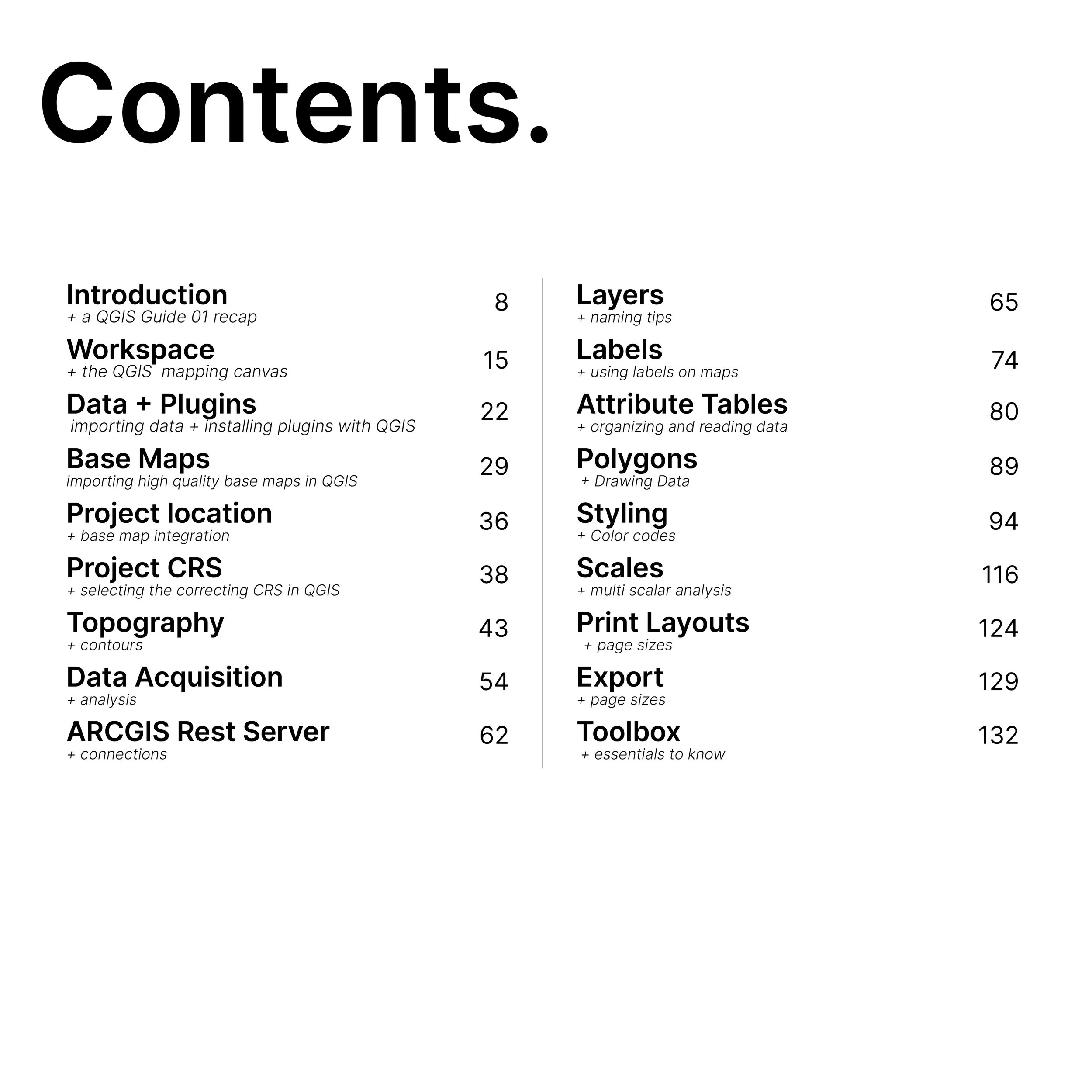
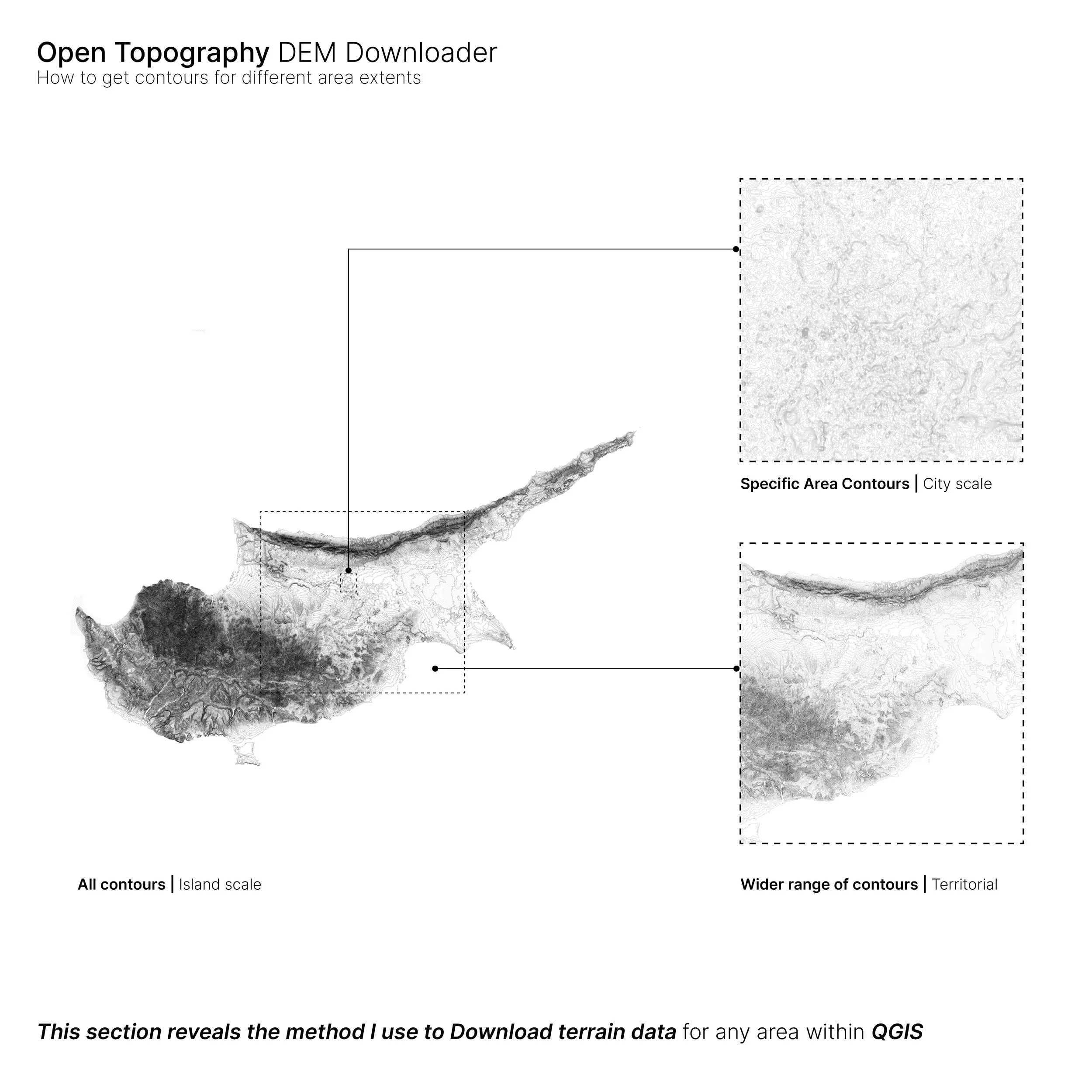
An Instant PDF Download
Color guide
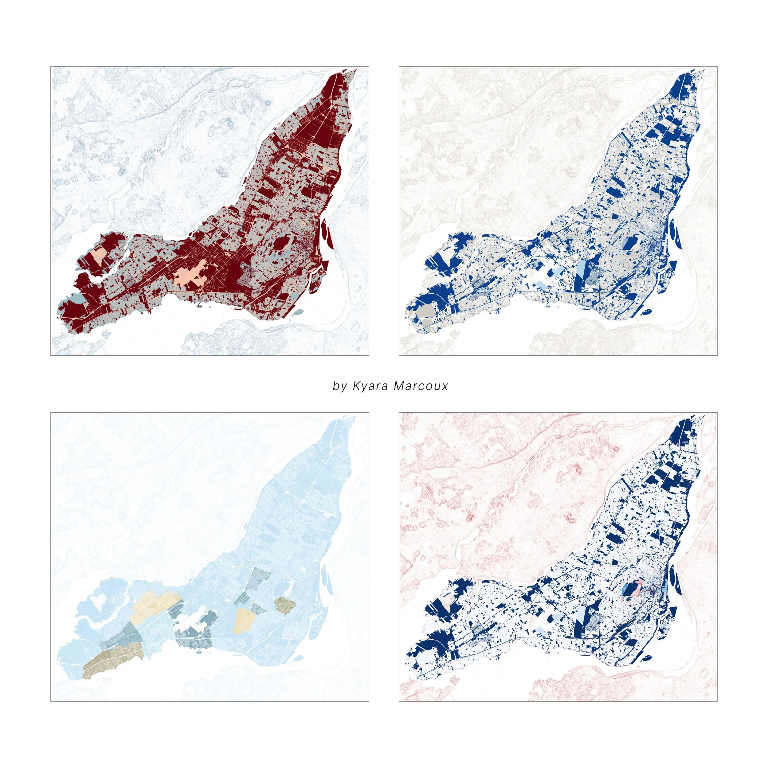
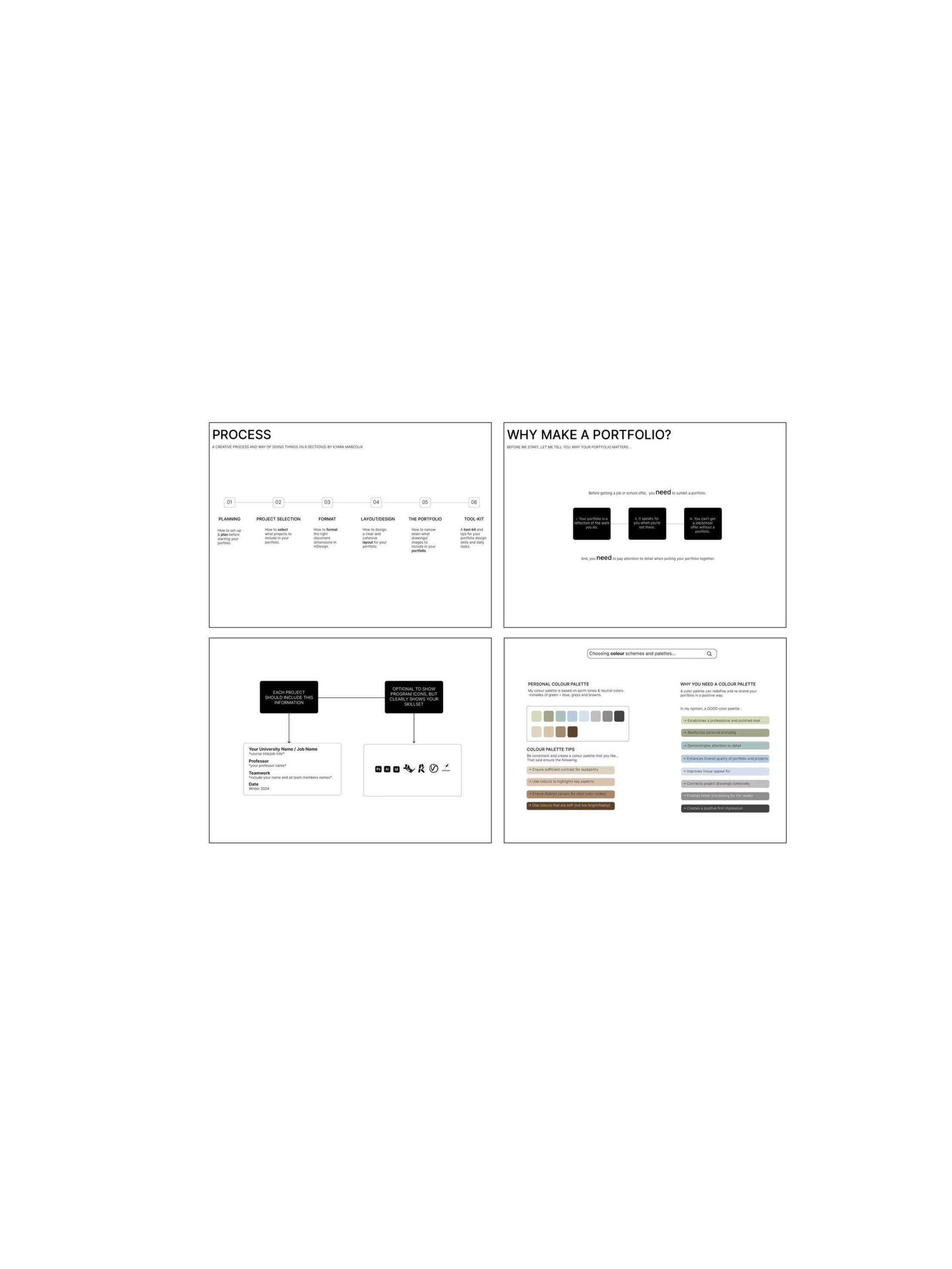
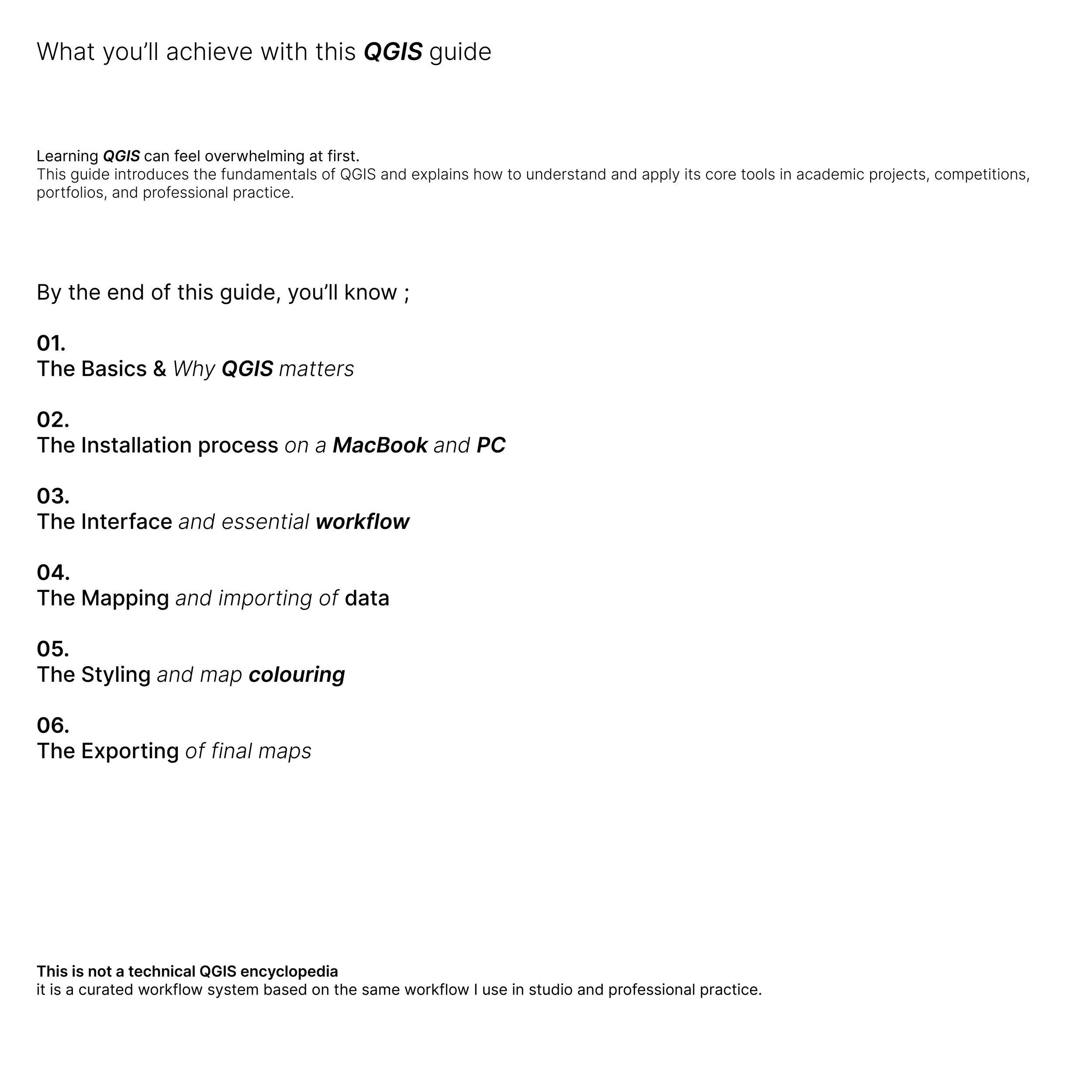
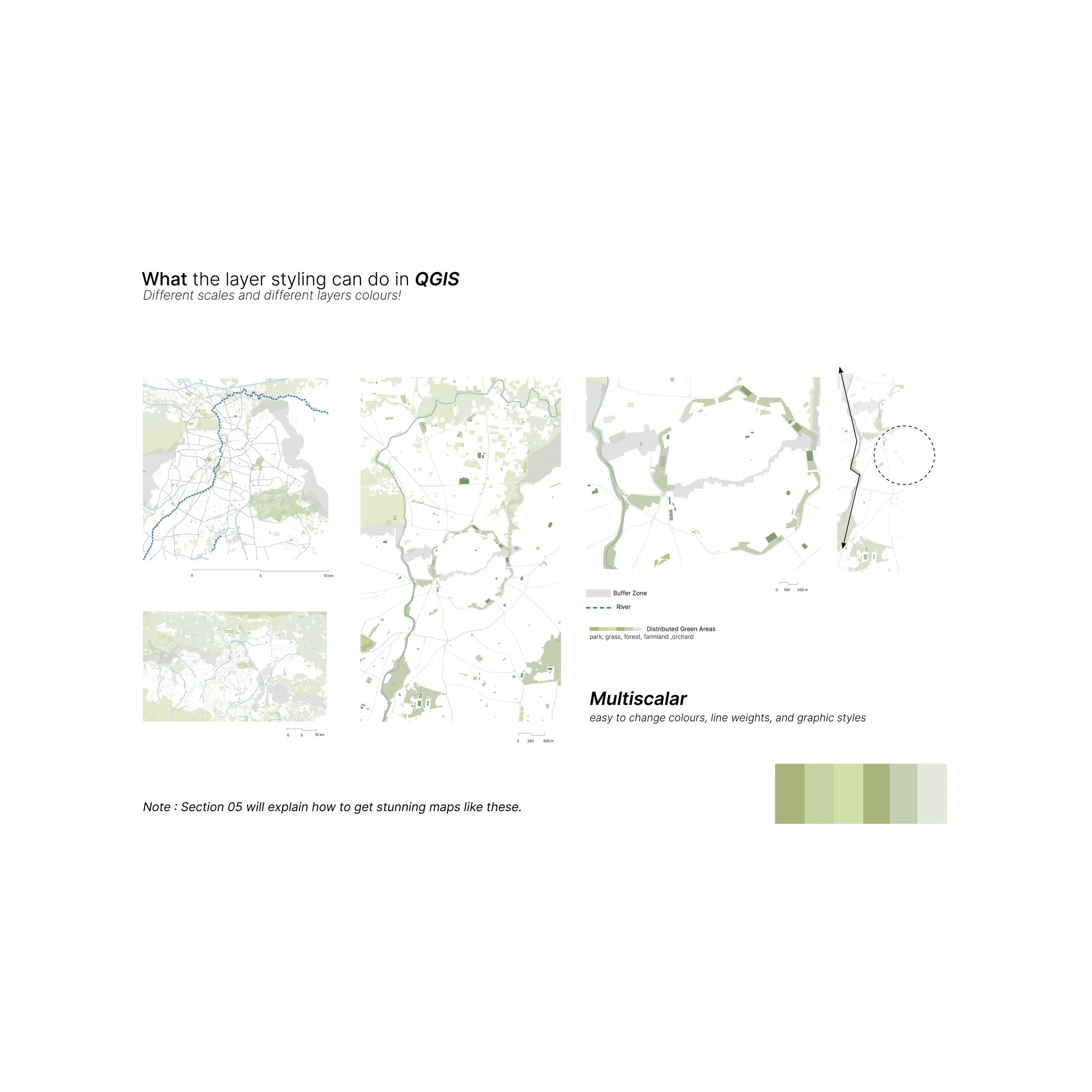
This visual color guide is designed for QGIS users who want to create maps that feel cohesive, intentional, and polished without spending hours experimenting with color combinations.
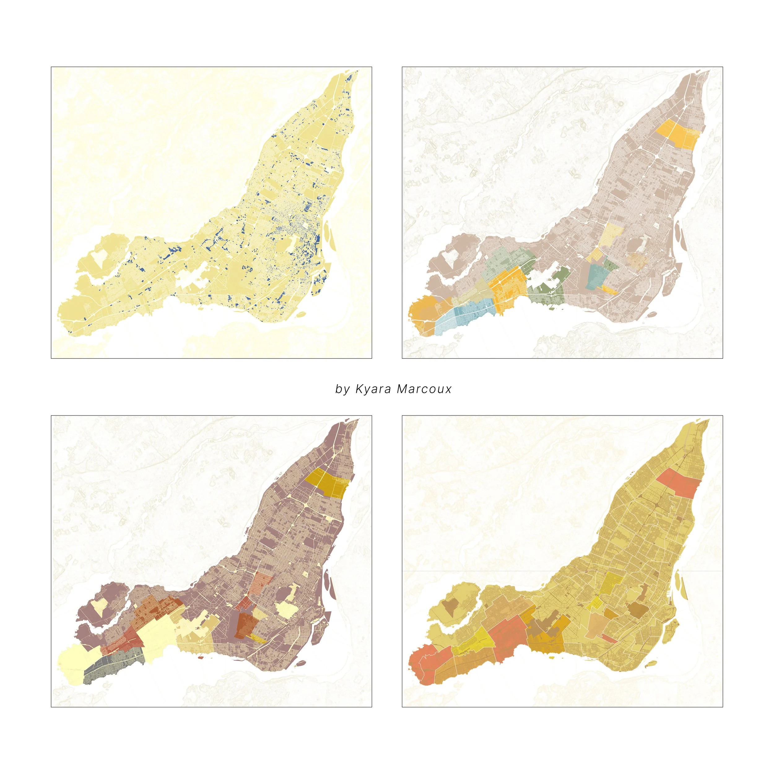
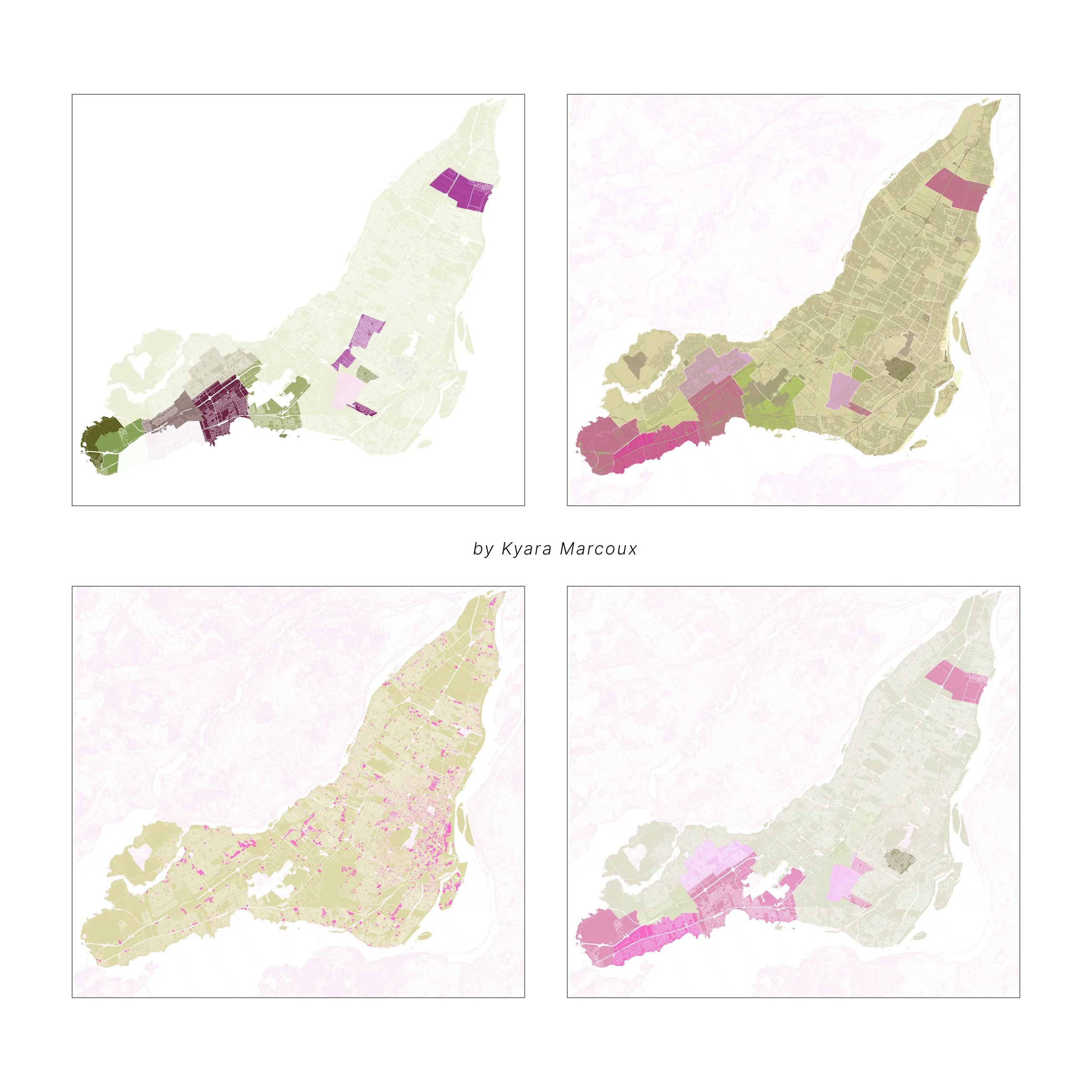
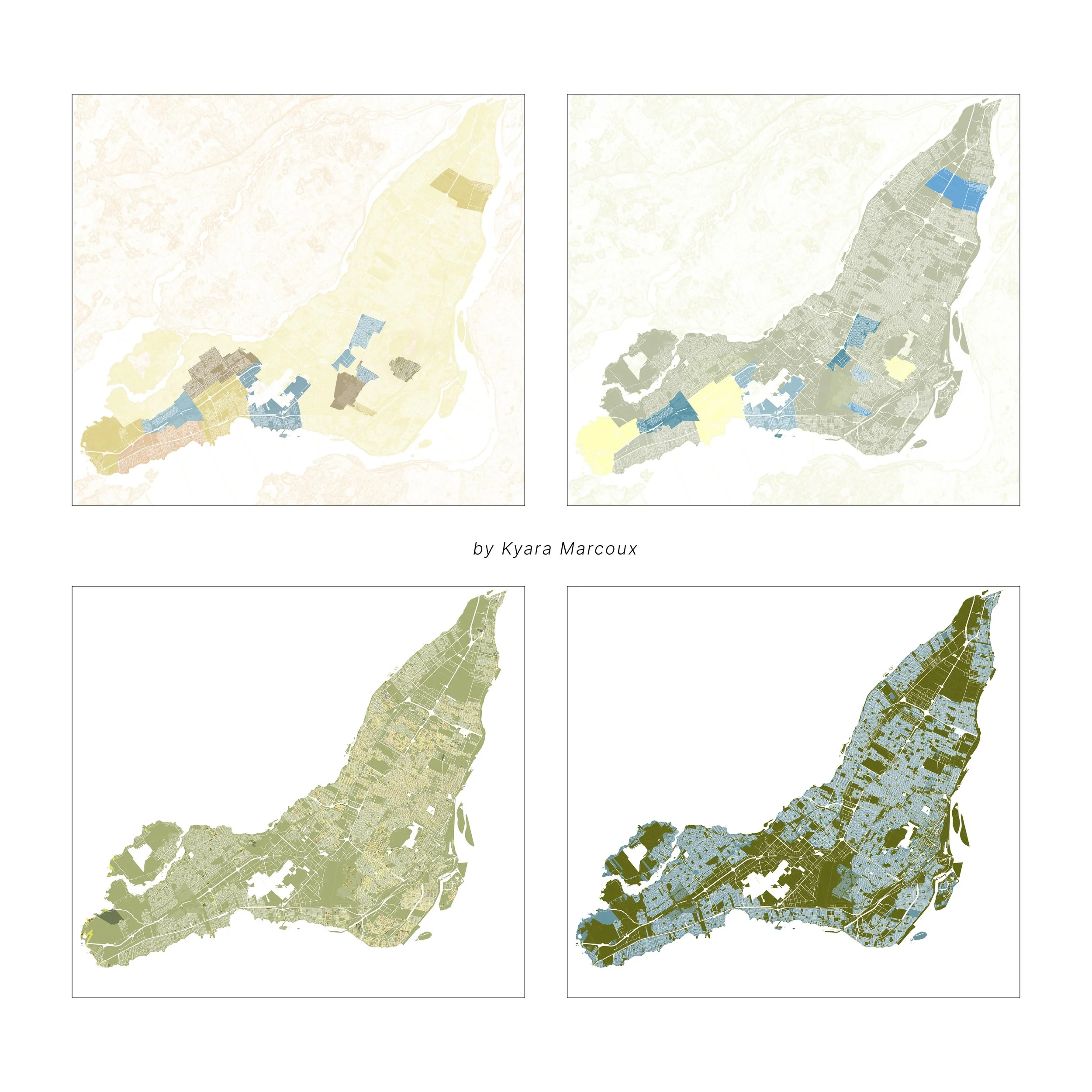
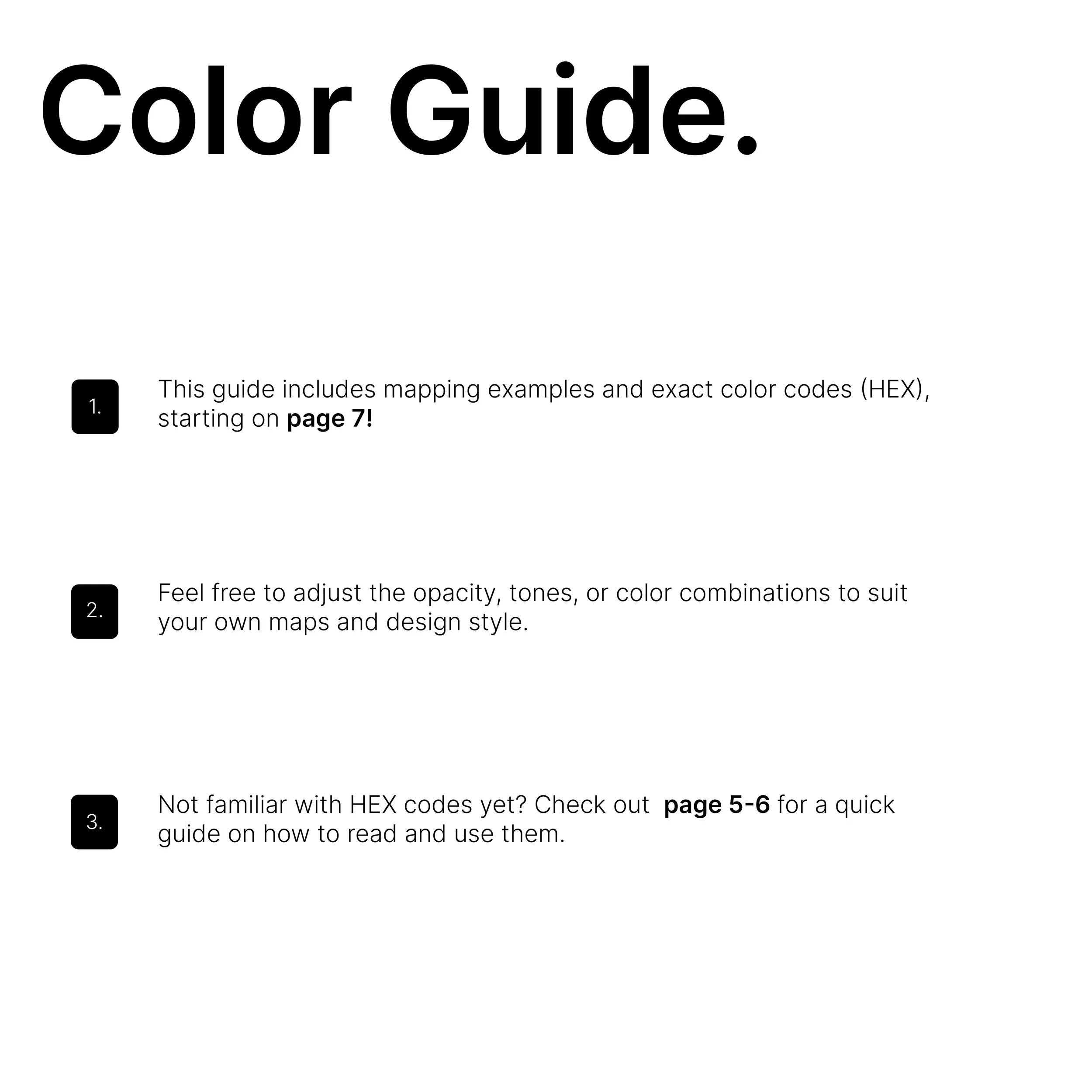
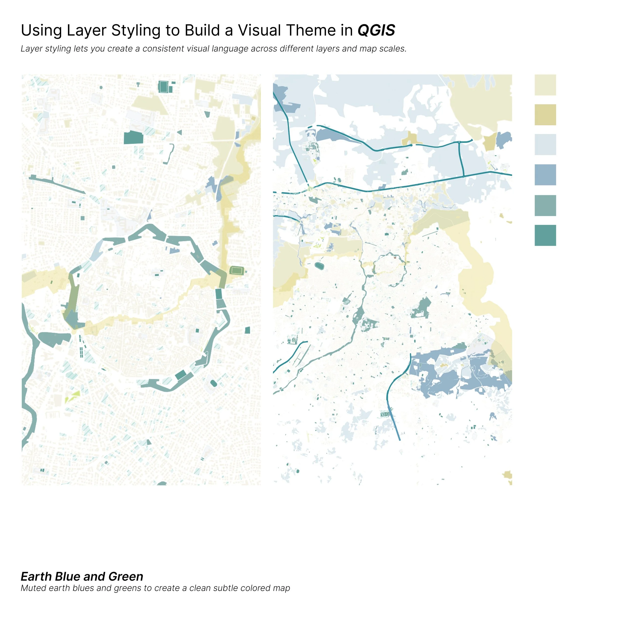
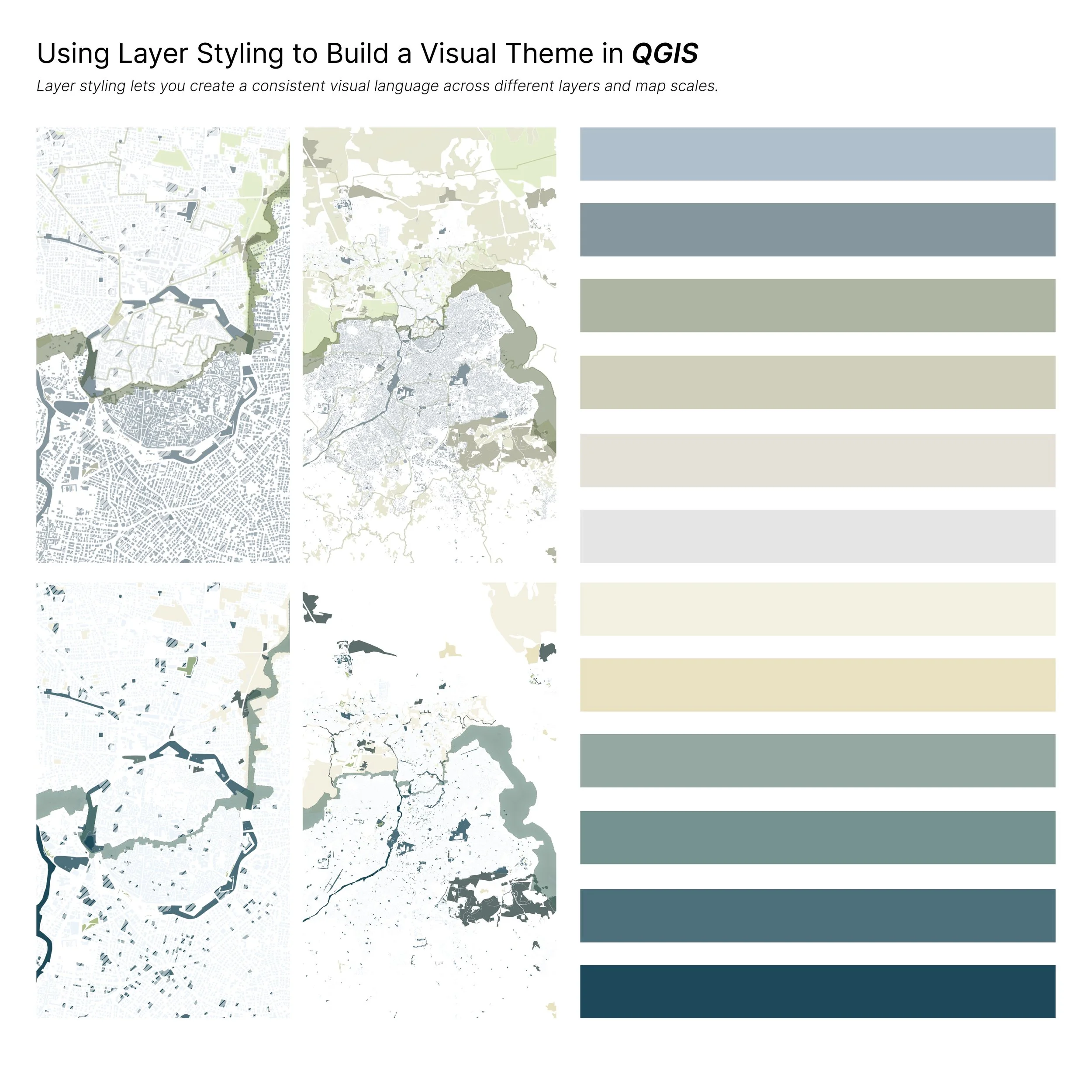
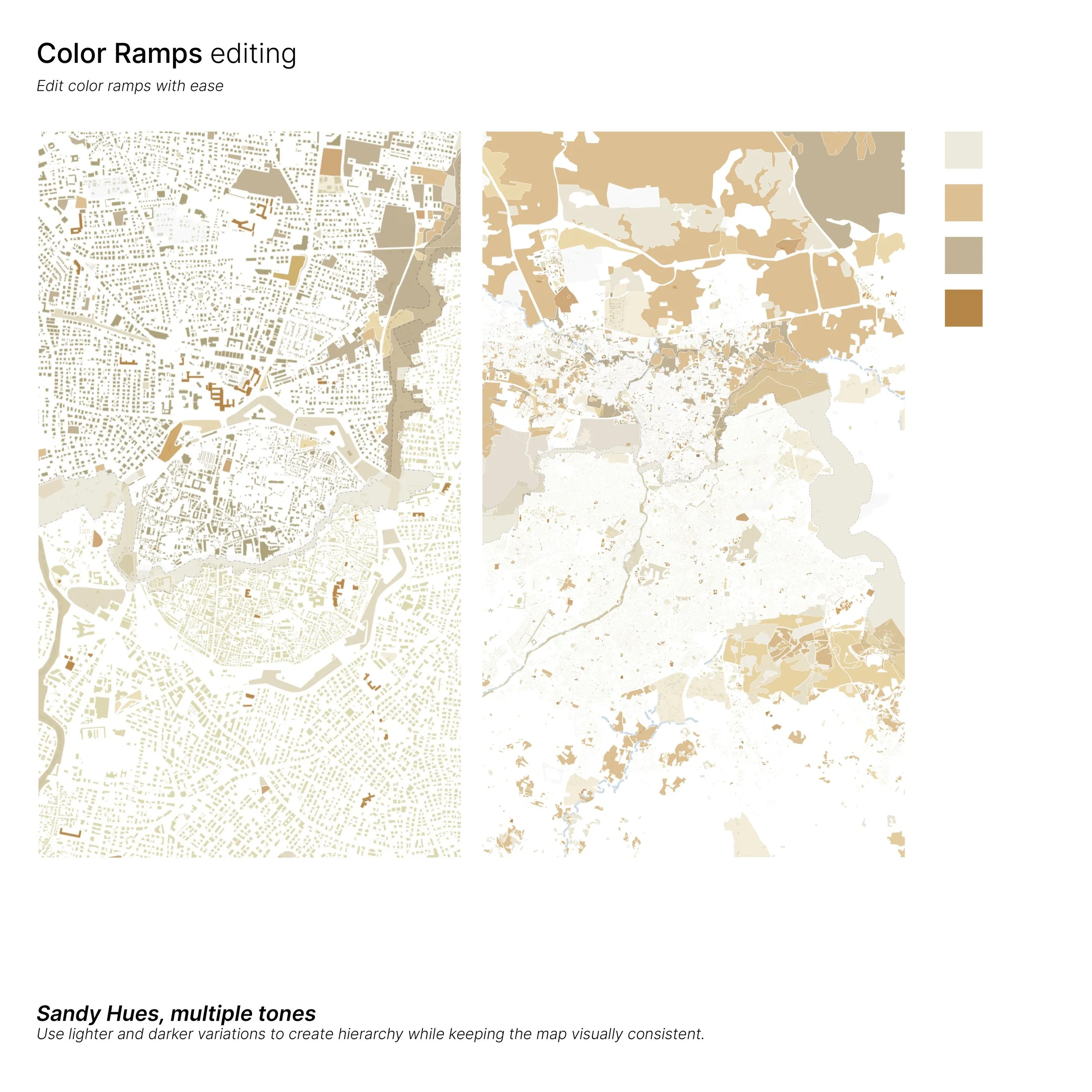
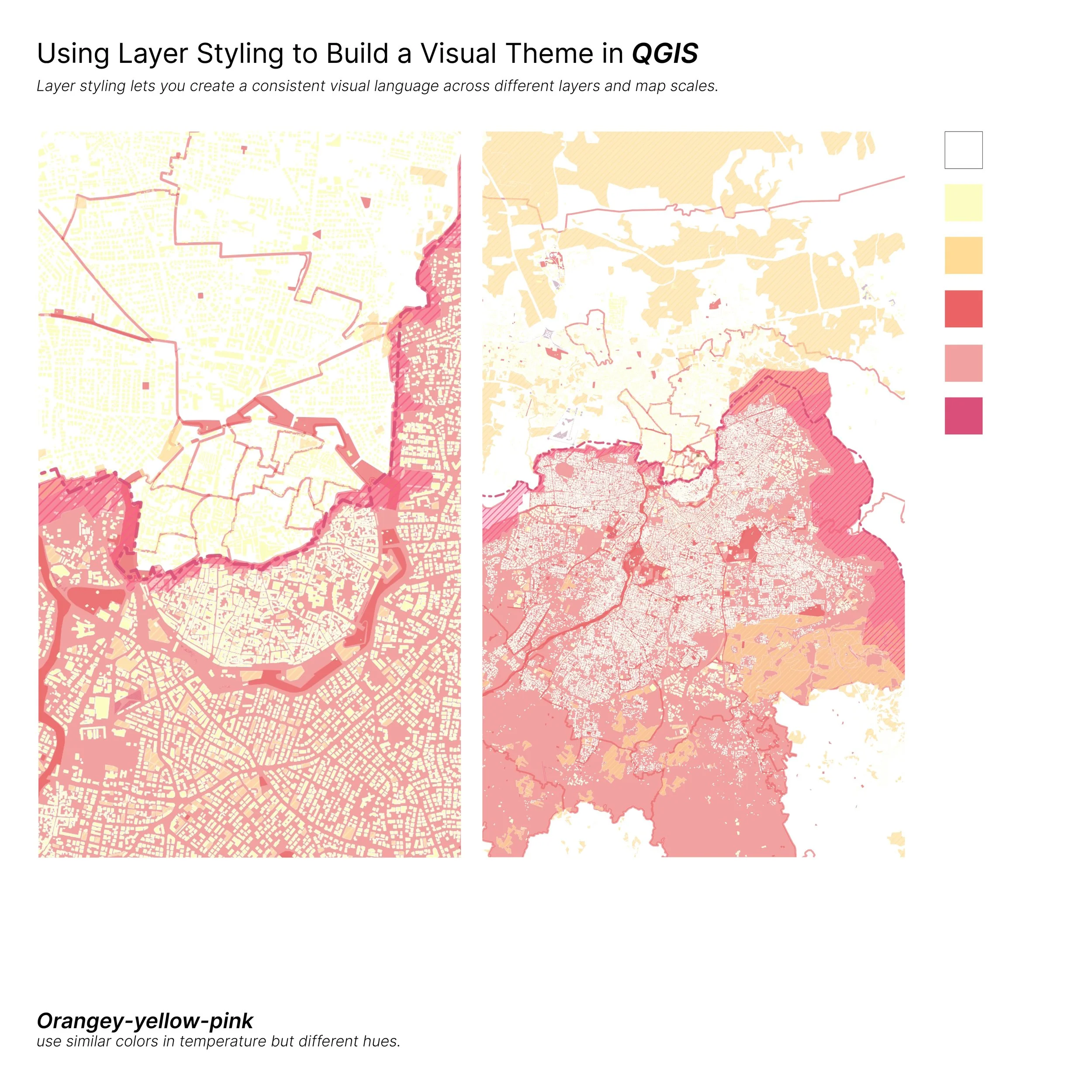
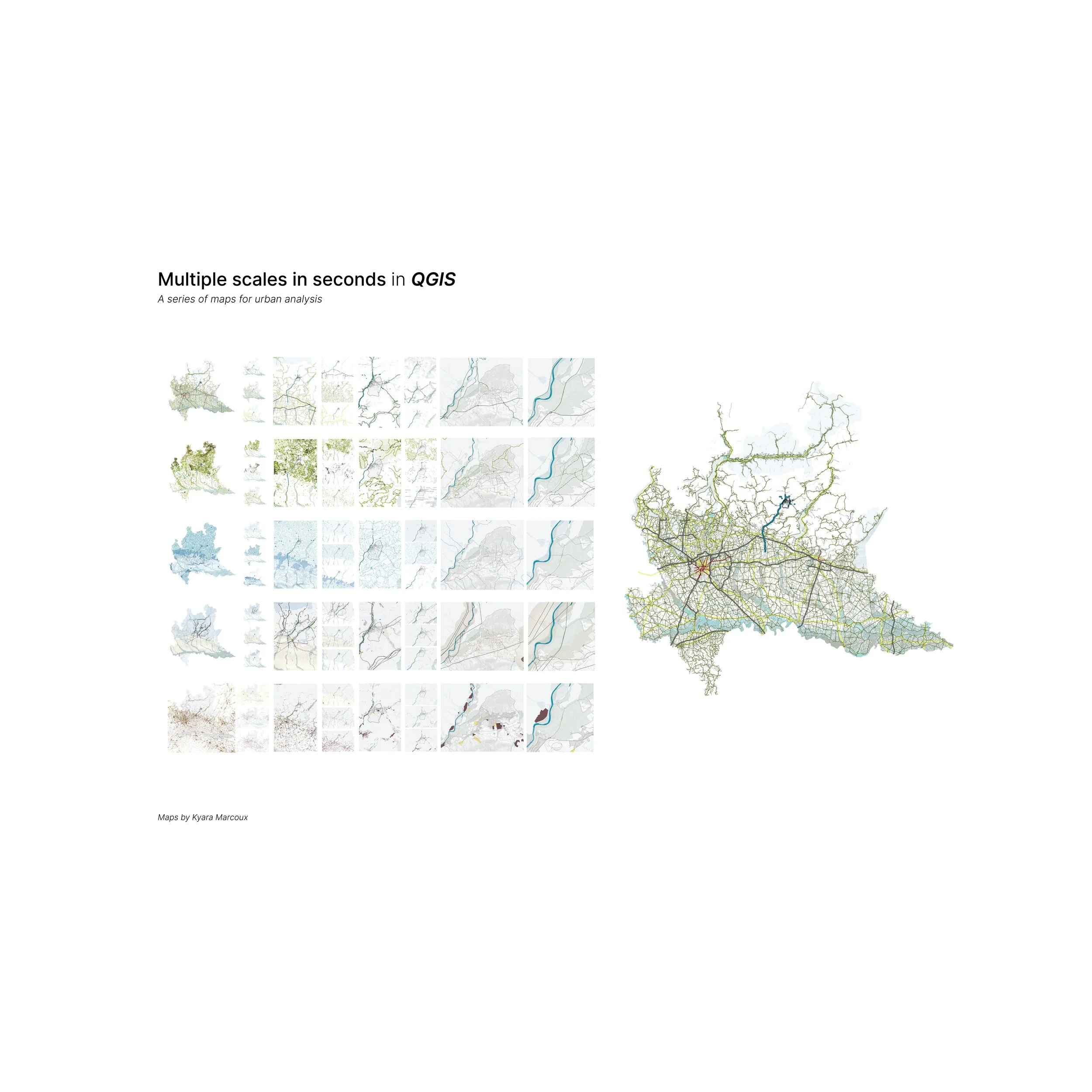
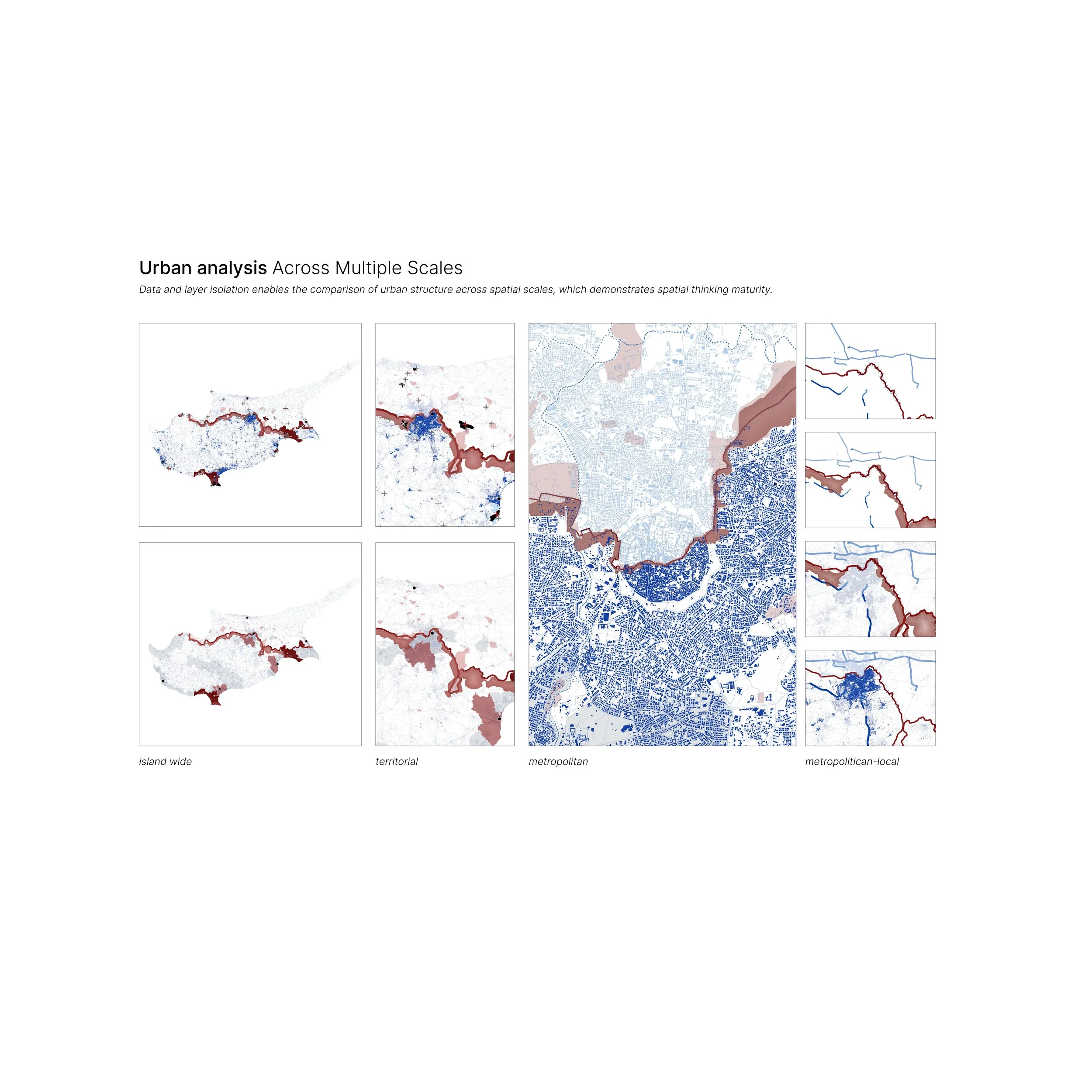
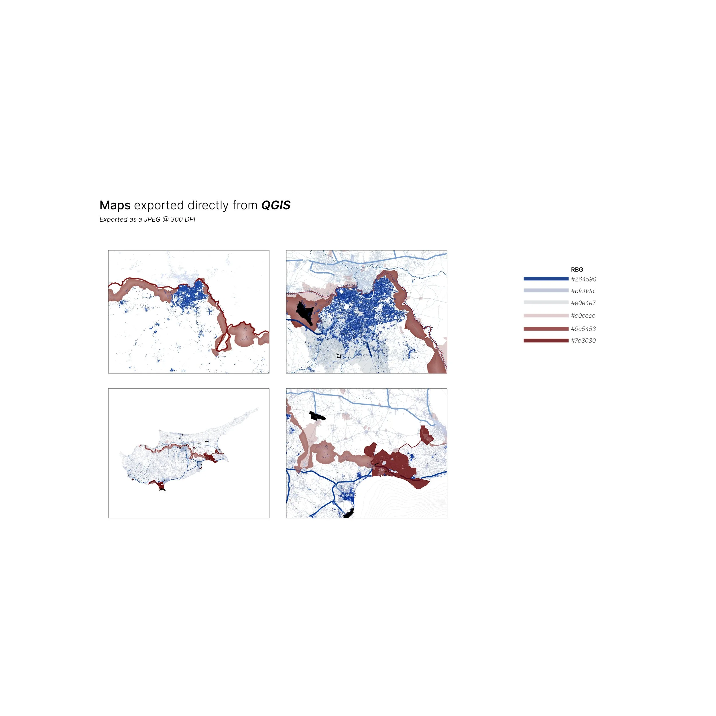
Inside, you’ll find a curated collection of map color palettes shown at multiple scales, so you can see how each combination works across a full map and in closer detail. Each palette includes HEX color codes for easy reference and styling inspiration you can adapt to your own QGIS projects.
From soft neutrals and monochromatic blues to earthy greens, bold magentas, and unexpected color combinations, this guide explores different ways to create contrast, hierarchy, and visual consistency through color.
Why download it?
→ Skip the color guesswork: Start with curated color combinations instead of testing endless options from scratch.
→ See colors in context: Each palette is applied to a map so you can see how the colors work together across different layers and scales.
→ Find inspiration faster: Use the guide whenever you need a starting point for your next map or want to try a new visual direction.
→ Create more cohesive maps: Learn from examples that use color, contrast, and hierarchy to bring different map elements together.
What it includes:
→ 30 page color guide with map examples and all HEX codes
→ A variety of monochromatic, muted, neutral, earthy, and colorful palettes
→ Color combinations shown at multiple map scales
→ Styling inspiration you can adapt to your own projects
Who should use this Guide?
→ Anyone using QGIS or mapping software
→ Architecture, design, urban planning, landscape architecture, GIS, or engineering students
→ Creatives and professionals looking for map styling inspiration
→ Anyone who wants to create more polished and visually cohesive maps
Why This Guide?
→ Visual and Easy to Follow: See the colors applied directly to maps instead of trying to imagine how individual swatches will work together.
→ Easy to Apply: Every palette includes HEX codes so you can quickly recreate the colors in your own projects.
→ Designed for Mapping: The palettes are selected with contrast, hierarchy, and multiple map layers in mind.
→ Made for Experimentation: Use the palettes exactly as shown or treat them as inspiration for developing your own style.
Note:
This is a Digital product (PDF guide.)
No physical item will be shipped.
QGIS is a trademark of its respective owner. This guide is an independent resource and is not affiliated with or endorsed by QGIS.
An Instant PDF Download
Color guide
This visual color guide is designed for QGIS users who want to create maps that feel cohesive, intentional, and polished without spending hours experimenting with color combinations.
Inside, you’ll find a curated collection of map color palettes shown at multiple scales, so you can see how each combination works across a full map and in closer detail. Each palette includes HEX color codes for easy reference and styling inspiration you can adapt to your own QGIS projects.
From soft neutrals and monochromatic blues to earthy greens, bold magentas, and unexpected color combinations, this guide explores different ways to create contrast, hierarchy, and visual consistency through color.
Why download it?
→ Skip the color guesswork: Start with curated color combinations instead of testing endless options from scratch.
→ See colors in context: Each palette is applied to a map so you can see how the colors work together across different layers and scales.
→ Find inspiration faster: Use the guide whenever you need a starting point for your next map or want to try a new visual direction.
→ Create more cohesive maps: Learn from examples that use color, contrast, and hierarchy to bring different map elements together.
What it includes:
→ 30 page color guide with map examples and all HEX codes
→ A variety of monochromatic, muted, neutral, earthy, and colorful palettes
→ Color combinations shown at multiple map scales
→ Styling inspiration you can adapt to your own projects
Who should use this Guide?
→ Anyone using QGIS or mapping software
→ Architecture, design, urban planning, landscape architecture, GIS, or engineering students
→ Creatives and professionals looking for map styling inspiration
→ Anyone who wants to create more polished and visually cohesive maps
Why This Guide?
→ Visual and Easy to Follow: See the colors applied directly to maps instead of trying to imagine how individual swatches will work together.
→ Easy to Apply: Every palette includes HEX codes so you can quickly recreate the colors in your own projects.
→ Designed for Mapping: The palettes are selected with contrast, hierarchy, and multiple map layers in mind.
→ Made for Experimentation: Use the palettes exactly as shown or treat them as inspiration for developing your own style.
Note:
This is a Digital product (PDF guide.)
No physical item will be shipped.
QGIS is a trademark of its respective owner. This guide is an independent resource and is not affiliated with or endorsed by QGIS.

 Image 1 of 6
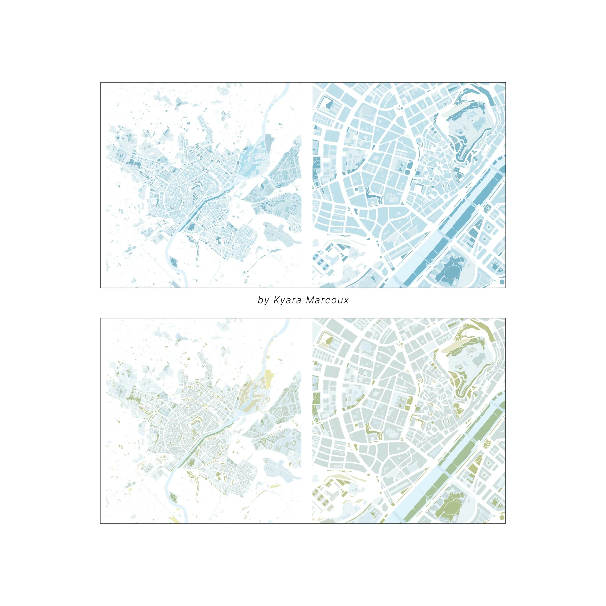 Image 2 of 6
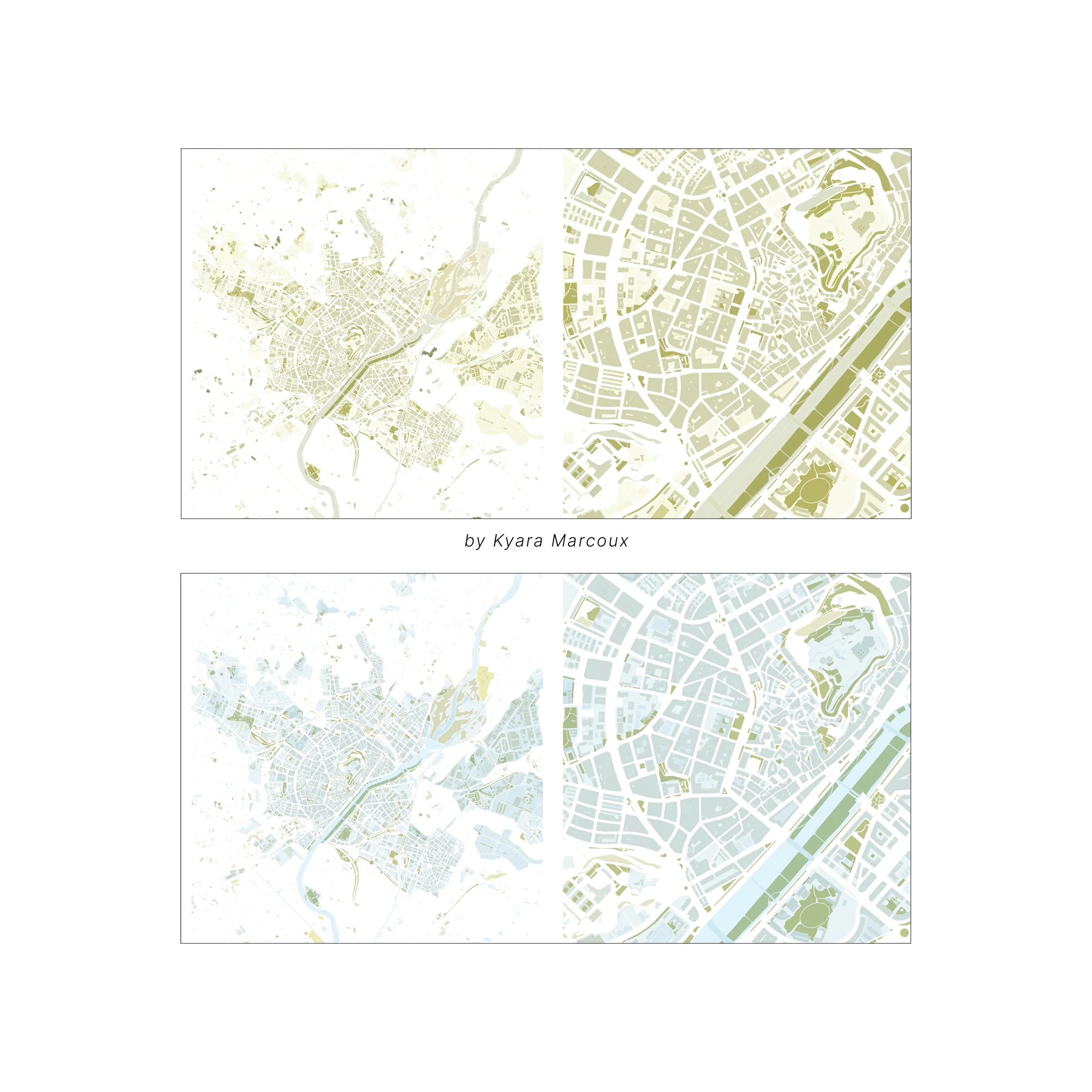 Image 3 of 6
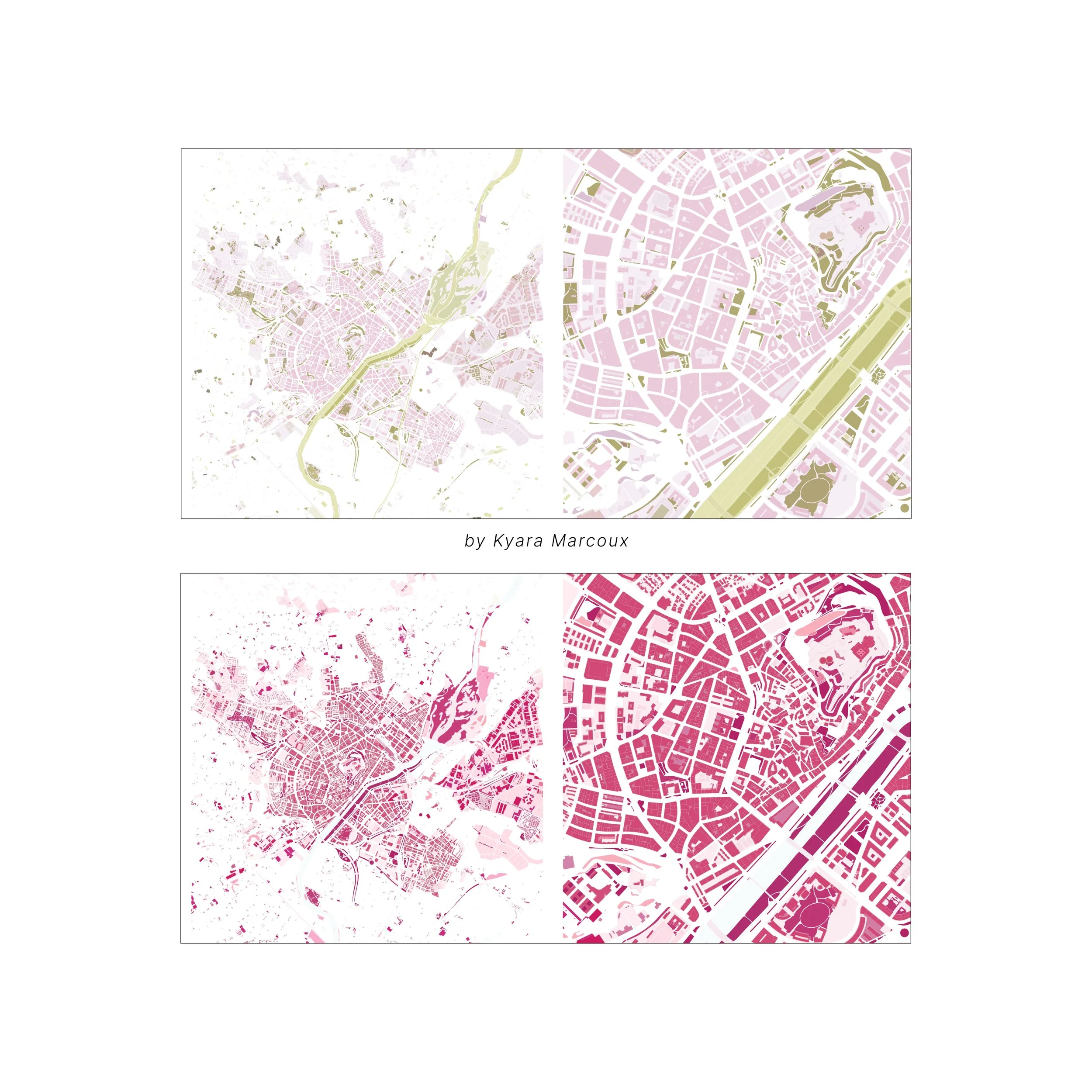 Image 4 of 6
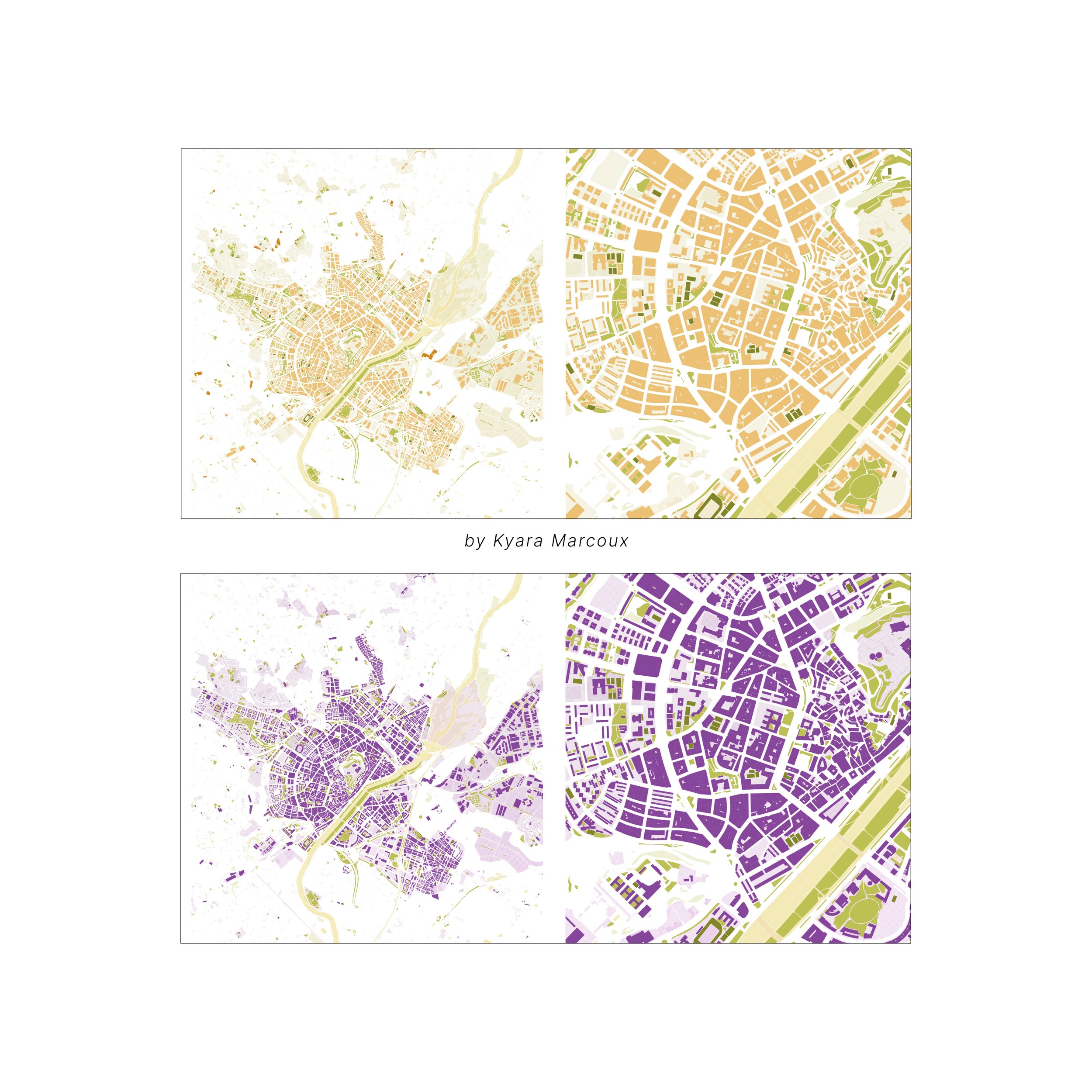 Image 5 of 6
 Image 6 of 6